
The Elephant in the Risk Governance Room

There is an elephant in the risk governance room.
Effective risk governance means organizations are making data-driven decisions with the best information available at the moment. The elephant, of course, refers to the means and methods used to analyze and visualize risk. The de facto language of business risk is the risk matrix, which enables conversations about threats, prioritizations and investments but lacks a level of depth and rigor to consider it a tool for strategic decision-making. However, there is a better option—one that unlocks deeper, more comprehensive conversations not only about risk, but also how risk impedes or enables organizational strategy and objectives.
Risk quantification coupled with results visualized via the loss exceedance curve (LEC) is one tool organizations can adopt to help them make informed risk investment decisions. Adopting risk quantification can help organizations unlock a true competitive advantage.
The Risk Matrix
Figure 1 gives an example of a typical risk matrix with 4 general risk themes plotted. The risk matrix is familiar to many organizations in several different industries. It is effective because it conveys, at a glance, information that helps leaders understand risk. In the example in figure 1, the risk matrix tells leadership the following:
-
Risk #1 seems to be about the same as risk #2.
-
Risk #1 and #2 are red, therefore, they should be prioritized for risk response over #3 and #4.
-
Risk #3 is yellow, therefore, it should be responded to, but not before #1 or #2
Figure 1— The Risk Matrix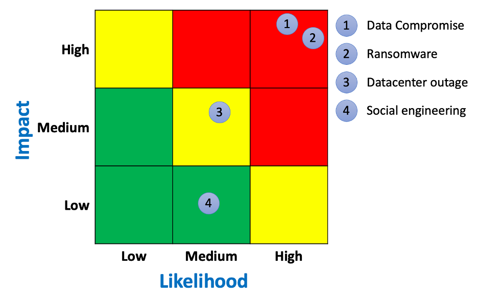
In other words, the matrix enables conversations about the ranking and prioritization of risk.


That might seem adequate, but it does not inform the inevitable next question: Are the organization’s security expenditures cost effective and do they bring good value for the money? For example, suppose a risk manager made the statement that investing US$1 million in security controls can reduce a red risk to a yellow risk. It may be accurate, but it comes with a level of imprecision that makes determining cost effectiveness, value and cost benefit difficult, if not impossible. With the risk matrix, the conversation about risk ranking is decoupled from the conversation about how much money to spend reducing risk.
Is there a better way?
Enter the Loss Exceedance Curve
If organizations want to have deeper conversations about risk, they should consider the LEC. Like the risk matrix, it is a visual display of risk, but it has several additional advantages. One advantage is that it enables investment conversations to happen alongside risk ranking.
Figure 2 shows the same risk themes as figure 1, but they are quantified and plotted on an LEC. The LEC may be new to cyberrisk practitioners, but it is a time-tested visualization used in many disciplines, including accounting, actuarial science and catastrophe modelling.
Figure 2— Loss Exceedance Curve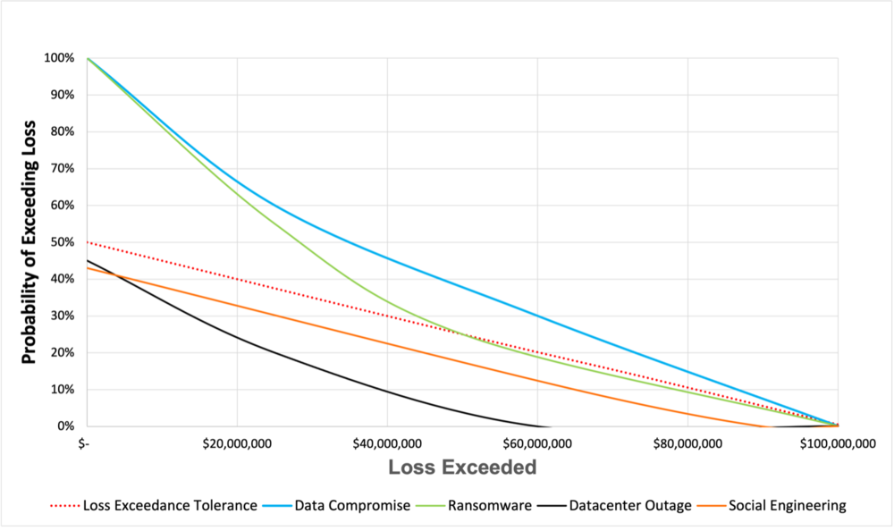
Organizations can follow each risk along the curve and draw conclusions. In this example, practitioners can follow the line for ransomware and draw the following conclusions:
-
If a ransomware attack occurs, there is a 60% probability that losses will exceed US$20 million and a 20% probability losses will exceed US$60 million.
-
There is a less than 10% probability that ransomware losses will exceed US$95 million. This can be considered a worst-case outcome—a widespread, massive ransomware attack in which critical systems are affected.
-
The red dotted line represents the organization’s loss tolerance, which can be thought of as the red quadrants in the risk matrix. It represents more risk than the organization is comfortable with, therefore, leadership should reduce this risk through mitigation, transference, avoidance or some combination of all 3.
LECs are generated from common cyberrisk quantification (CRQ) models. OpenFAIR is one such model, but many others can be used in cyberrisk. In this case, the risk analyst would input probability and magnitude data from internal and external sources into the model and run a set number of simulations. For example, the model can be set to run 100,000 iterations, which is equivalent to 100,000 years of the organization.
Once organizations have learned how to understand the LEC, a whole new world of data interpretation becomes available. The first step in understanding the LEC is to compare how a single risk is visualized on the risk matrix vs. the LEC.
In figure 1, the risk matrix leads viewers to believe that there is 1 outcome from a ransomware attack: high risk, which is universally thought of as negative. However, the LEC shows that this is not the case. There is a wide range of possible outcomes, including losses from US$1 thousand to US$100 million. The range aligns with what is known about ransomware attacks. Losses vary greatly depending on many factors, including how many systems are compromised, when defenses detect the malware (e.g., before infection, during the attack, after the ransom demand) and if the attack is caught early enough to allow for an intervention. A single color in the risk matrix cannot communicate these subtleties, and leadership is missing out on essential investment decisions by not considering risk that exists in other colors of the risk matrix.
The LEC also enables meaningful conversations around project planning, investment decisions and deeper discussions on how to best respond to risk.
In this example, the risk matrix led the organization to believe that that the risk of ransomware and data compromise is the same (high) and that leadership should treat them equally when mitigation planning. However, the LEC shows that data compromise has higher projected losses than ransomware and by how much. Worst-case outcomes also occur at different probabilities. This difference is significant when deciding where on the curve to manage risk: most likely outcomes, worst-case outcomes or somewhere in between.
The LEC establishes a financial baseline for further analyses, such as cost/benefit, evaluating capital reserves for significant losses, evaluating insurance and control comparisons.
Conclusion
Increasingly, organizations are data-obsessed and use analysis and interpretation to make decisions, yet many still use one-dimensional tools such as the risk matrix to manage risk. It is an elephant in the proverbial decision-making room and a problem that is too big to ignore.
This article was previously published by ISACA on July 19, 2021. ©2021 ISACA. All rights reserved. Reposted with permission.
*** This is a Security Bloggers Network syndicated blog from Blog - Tony Martin-Vegue authored by Tony MartinVegue. Read the original post at: https://www.tonym-v.com/blog/2021/7/21/the-elephant-in-the-risk-governance-room