.jpg)
Later this year or early next, Windows 11 will begin rolling out to new and existing devices with a range of new features and major design improvements.
Windows 11 is technically Windows 10 with rounded corners, a new modern design and Fluent icons. Start Menu is also doesn't come with traditional live tiles and it will show your apps and websites in a grid layout, similar to Windows 10X and ChromeOS.
As it turns out, native Windows apps are also getting a major redesign as part of the new operating system. The new look for native apps was highlighted during the event video and there's a chance we might see these new apps in the upcoming preview builds.
File Explorer
File Explorer, which has barely changed since Windows 8, is getting rounded corners, new icons and a new header that replaces the current ribbon toolbar.
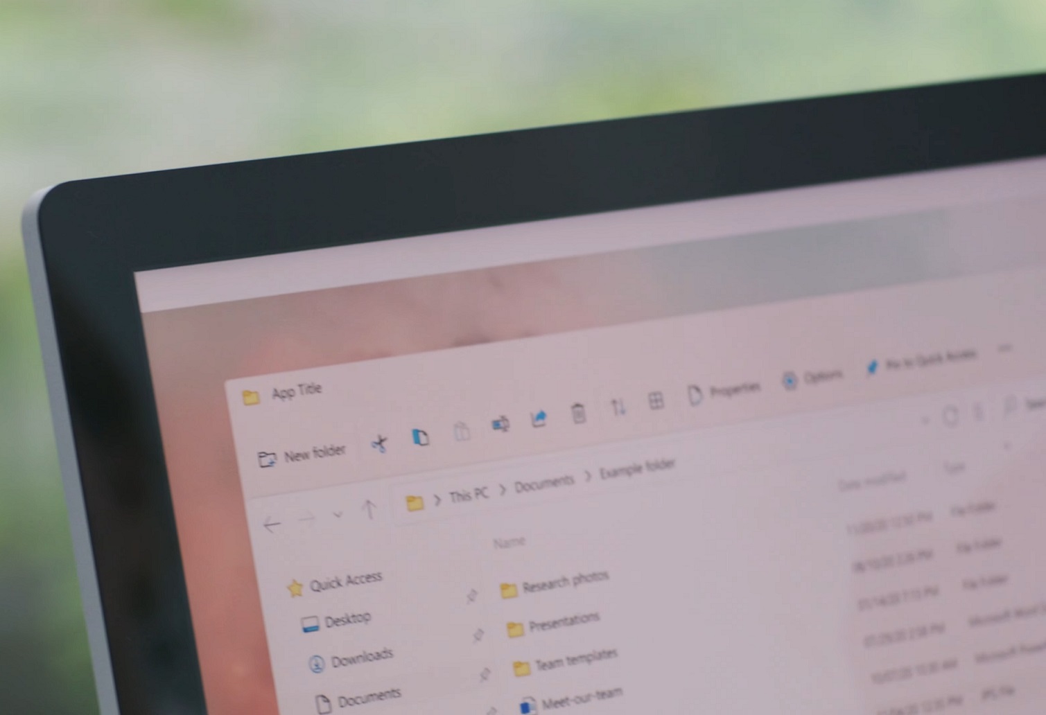
As you can see in the above screenshot, the ribbon toolbar/menu at the top of the window is now gone.
The updated Explorer now features a Fluent Design-like header menu with icons and rounded edges, but the basic functionality of the Explorer remains unchanged.
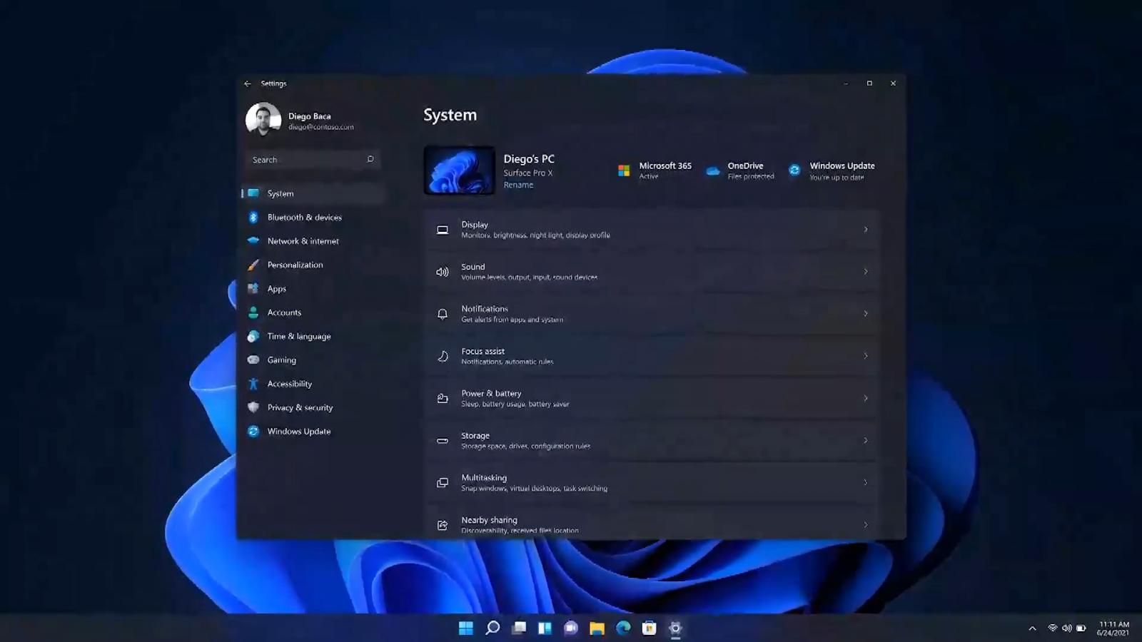
Windows Settings
Microsoft is also updating the native settings app with a redesigned look that features rounded corners, Fluent icons, and a new navigation menu on the left side of the window.
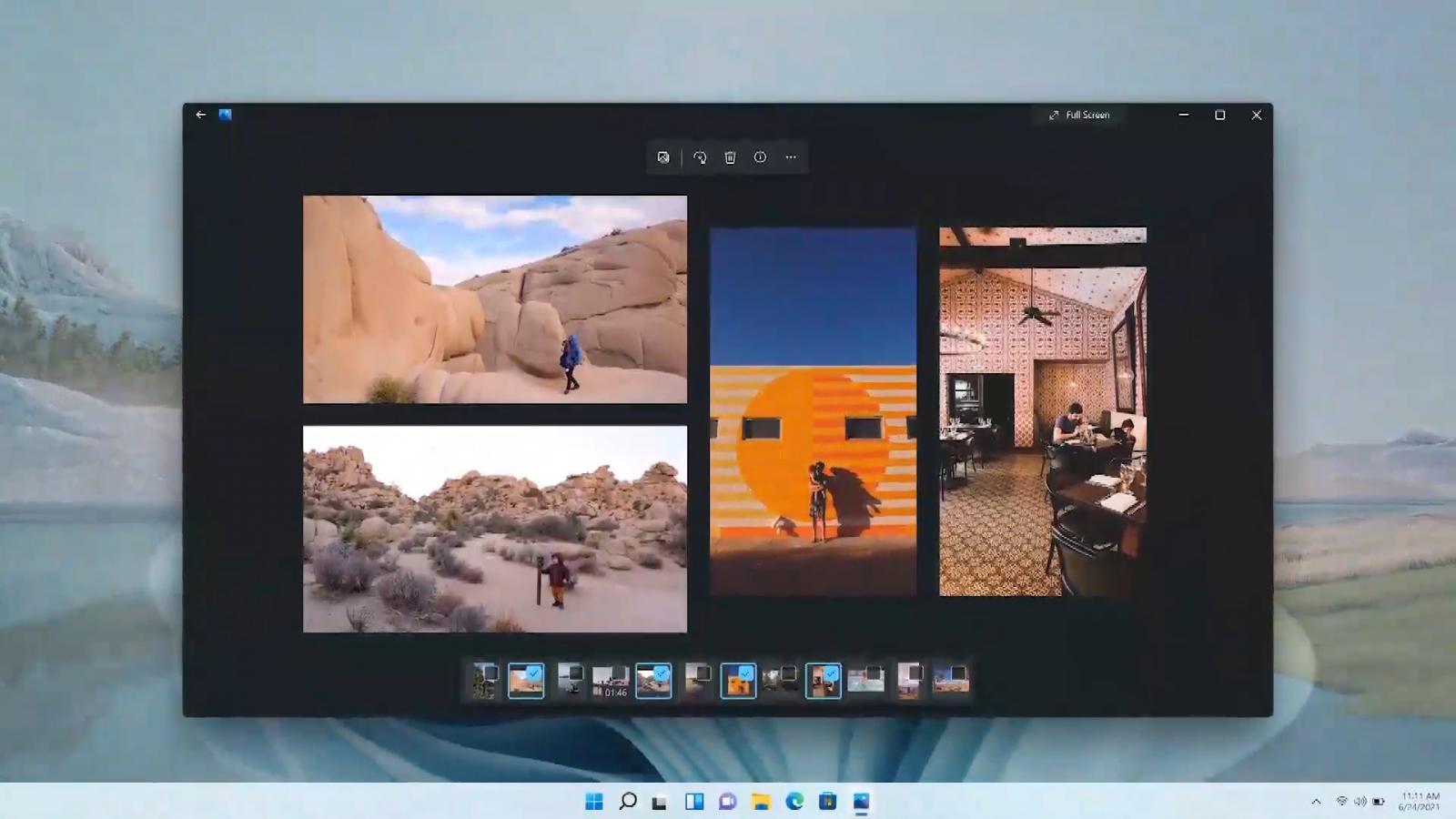
Microsoft Photos
Microsoft Photos is also receiving a new design and it seems to be using WinUI-controls. However, it's not yet clear if Microsoft is working on any new features for Photos app.
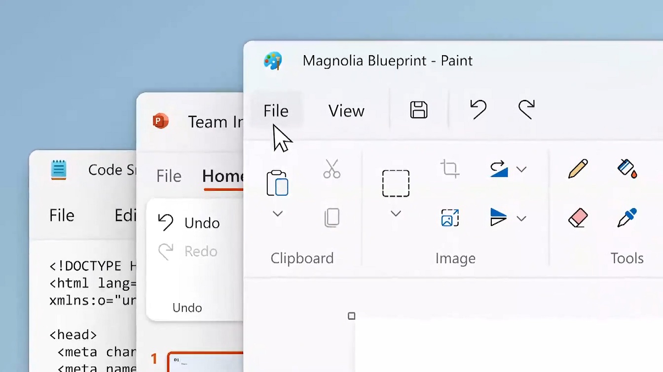
Microsoft Paint and Notepad
Like File Explorer, Microsoft's Paint and Notepad are also getting a new header where you can find the brushes, undo, search and other options.
Office app
Microsoft Office apps will be updated with the same header menu. In the below teaser, you can see a new look for the current PowerPoint app. The overall design has remained unchanged, but you can easily spot new changes.
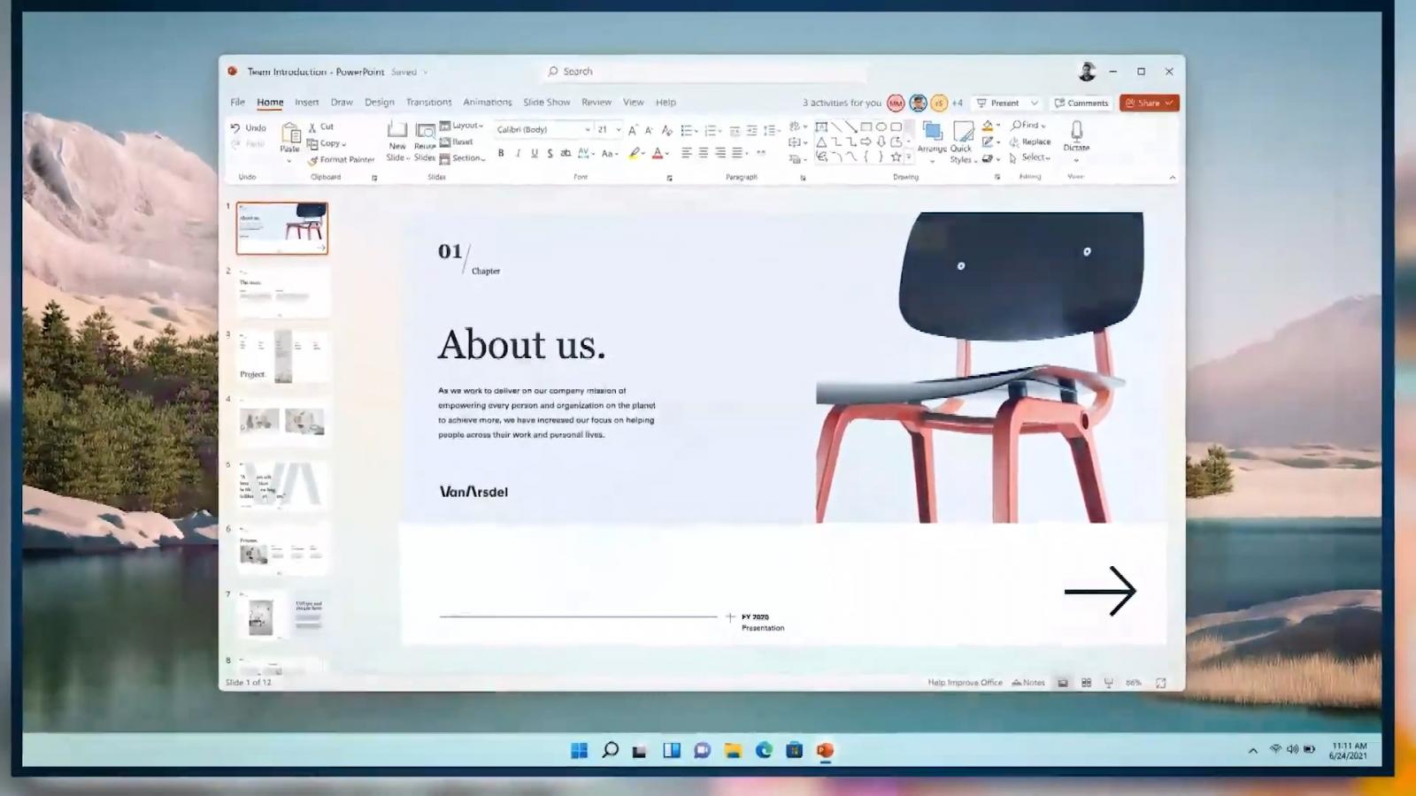
For example, PowerPoint is now using updated icons and rounded corners for options within the new header, similar to other native Windows apps like MS Paint and Notepad.
In addition to these new screenshots, Microsoft has also uploaded a teaser video that gives us a closer look at upcoming improvements.


Comments
NickAu - 2 years ago
Meh eye candy, as a member said in another post, the gui was designed for millennials and 12 yr old girls to mess about on facebook.
AlfaX - 2 years ago
"Meh eye candy, as a member said in another post, the gui was designed for millennials and 12 yr old girls to mess about on facebook."
God forbid Microsoft change with its changing user base. I'm not a huge fan of it either, but this has some real "Get off my lawn" vibes lol.
h_b_s - 2 years ago
"Meh eye candy, as a member said in another post, the gui was designed for millennials and 12 yr old girls to mess about on facebook."
No, it's designed for the average consumer and business desk-jocky to use regularly. You know, that 90% of desktop users you so casually dismiss. Windows 11 finally gets some of the usability right in a multi/wide screen world after a decade of common place wide monitors and growing popularity of HiDPI monitors with that central start/task menu. Staring at a screen 8+ hours a day some nice looking aesthetics is good thing!
The problem with Microsoft is that they traditionally go 2/3s of the way there, then stop. So parts look like WfW, Win95, XP, 7, 8.1 without any real consistency. I like the looks of the 11 desktop, but it's basically still lipstick on a pig even if it's a pleasing color.
No1gr8 - 2 years ago
I prefer the current start/task menu that allows you to dock it wherever you want on each monitor. v11 is bottom only. I'll take function over design. Yes, same pig no matter how you dress it.
BoneBreaker - 2 years ago
I have to say it... I like it.
handsonmatheus - 2 years ago
Excellent job, Mayank.
sdel85 - 2 years ago
There was a time that Microsoft used to make fun of Apple because all there big changes were just visual and now Microsoft is doing the same thing. Give use tabs! For notepad and for Explorer, I could get behind all the beautification if you actually gave functionality like this too.
BH0 - 1 year ago
This partial re-desing is just PR and marketing. The sadest thing about it is, that if some "beginner" wants to educate in "working on computer", all the companies offer MS Office course as the critical knowledge. This creates monopoly for Microsoft, when enormous number of users are using it, just because other do.
Its not true, that Microsoft is the best, nor that MS Office has no concurent applications. Its just not true. There are better solutions, but the market has tendency to remain the same.